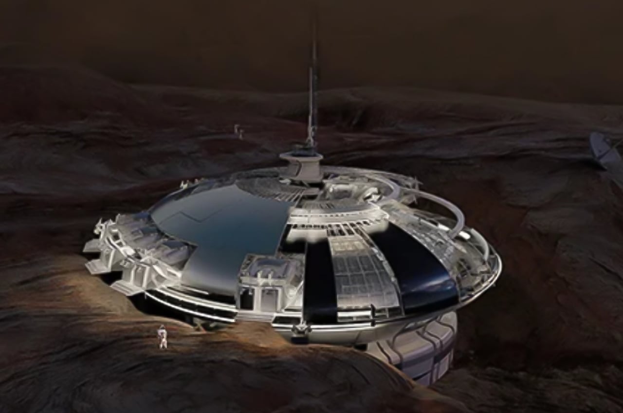
Establishing a new human colony on another planet is an opportunity to apply new designs. More importantly, however, it’s also an opportunity to learn from humanity’s past mistakes in building habitats.
Although we have yet to fully conquer the moon or even our oceans, some people are already eyeing Mars as our backup Earth. Of course, the planet is completely uninhabitable in its current state, but there is no shortage of ideas on how to make human life possible on the red planet. Some ideas involve radical terraforming, while others try to limit the changes inside enclosed structures. One concept, in particular, tries not to repeat the sins of the past and make use of Mars’ natural landscape rather than go against it.
Designers: Burak Celik, Naz Kaplan and Zeynep Ege Odabasi.
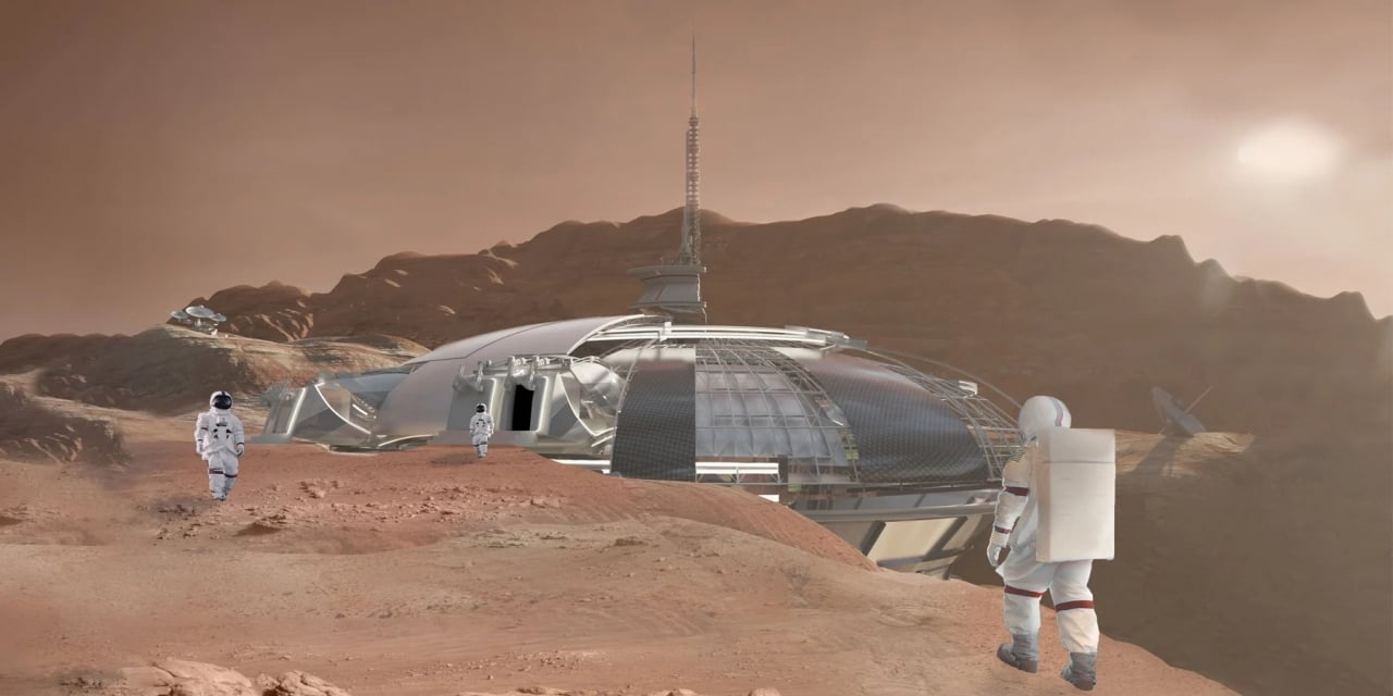
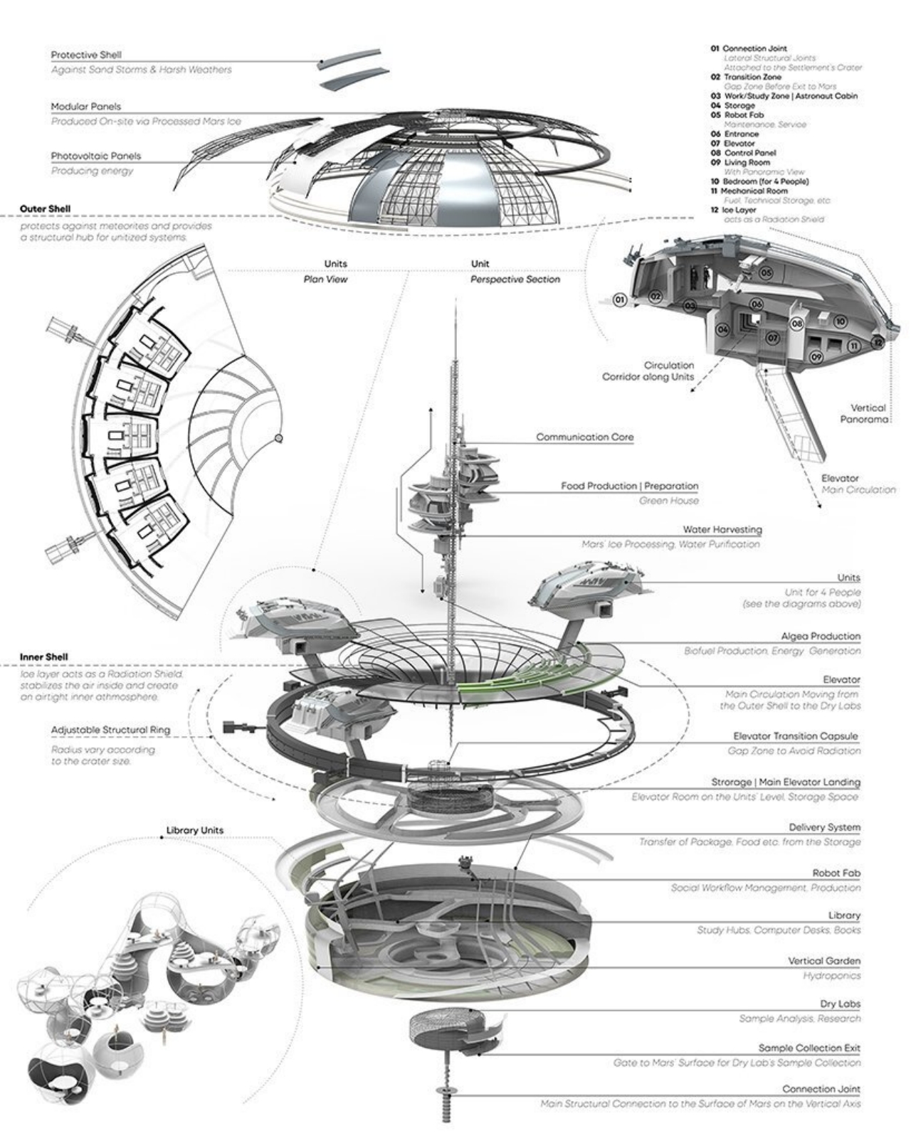
Of course, we can’t fault our ancestors for not knowing better, but that is also why we have to make sure we don’t make the same mistakes when trying to extend our civilization’s reach to other planets. This architectural design concept doesn’t focus as much on the technologies that will make human, animal, and plant life possible but on making sure we don’t change the face of our new home as we did the old one. In particular, the donut-shaped colony is designed to take advantage of the Martian landscape instead of trying to mold it to our needs.
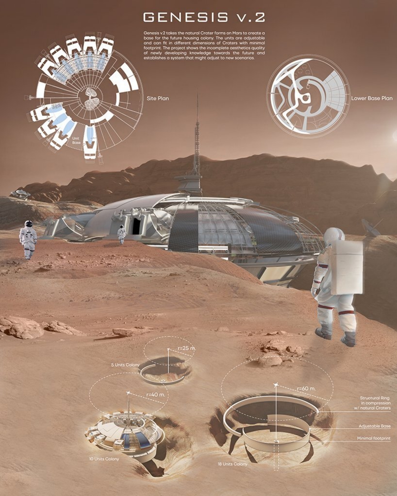
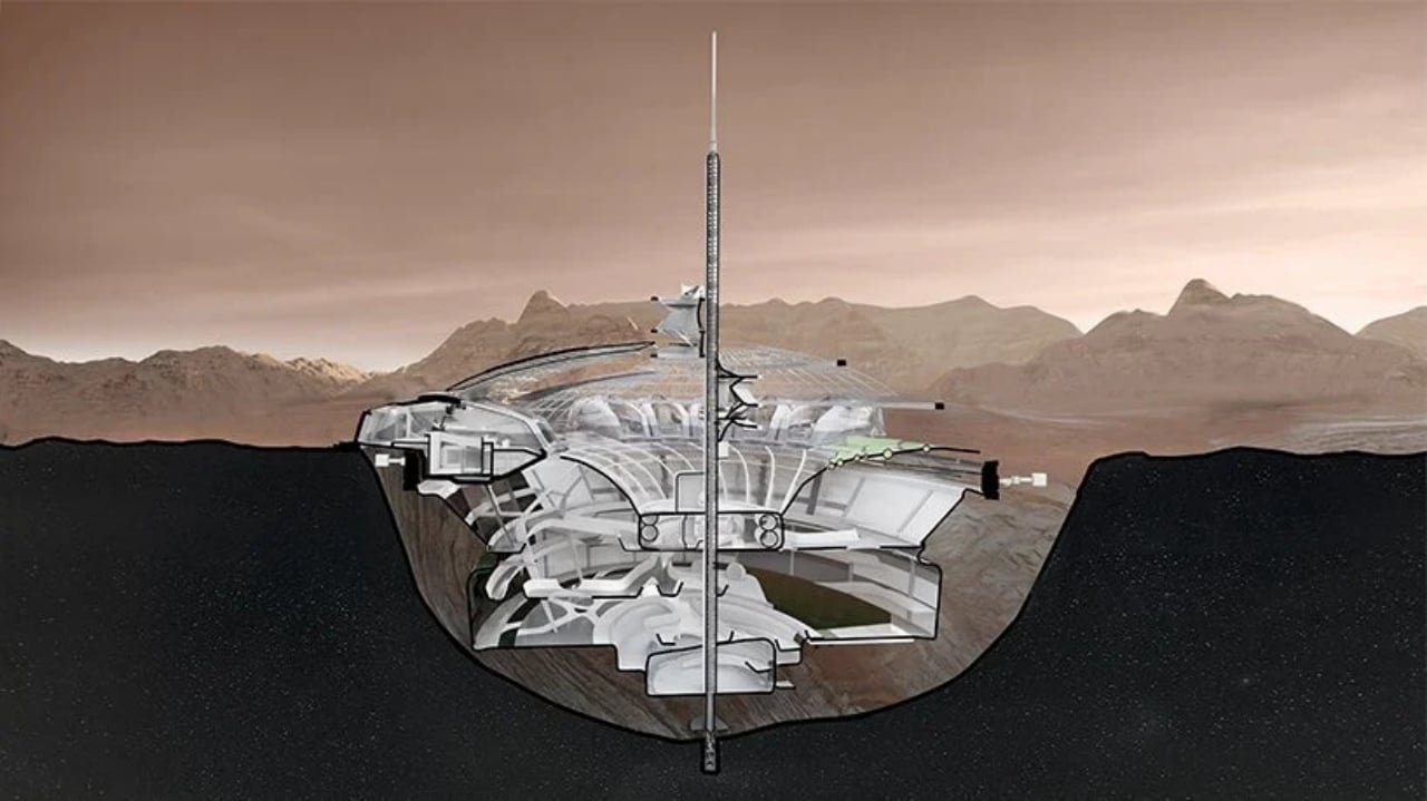
Genesis v.2, as the prototype is called, is designed to sit on the edge of craters rather than on more level surfaces that may be a rarity on Mars. This has two advantages, one being that the colony could actually protect itself from radiation without having to dig more holes on the already battered face of the planet. It offers an opportunity to start off on the right foot with sustainable structures, ensuring that Mars will survive longer than our Earth.
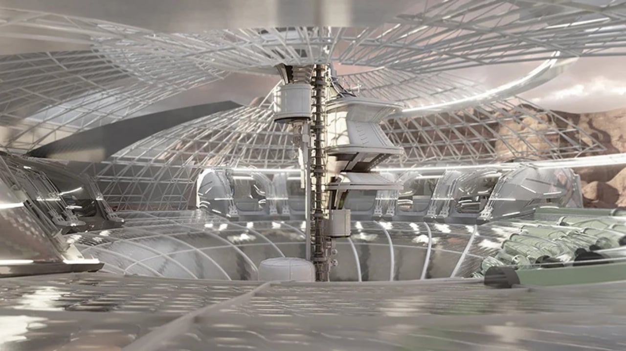
The design of Genesis v.2, however, is also adjustable and relocatable so that expanding the population doesn’t require establishing another colony. The radius of the ring could be expanded to accommodate more units, for one. If necessary, however, the central production and circulation tower could also be relocated to a different crater that can support an even bigger ring.
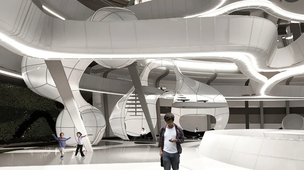
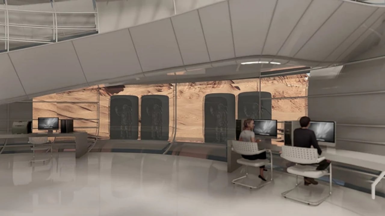
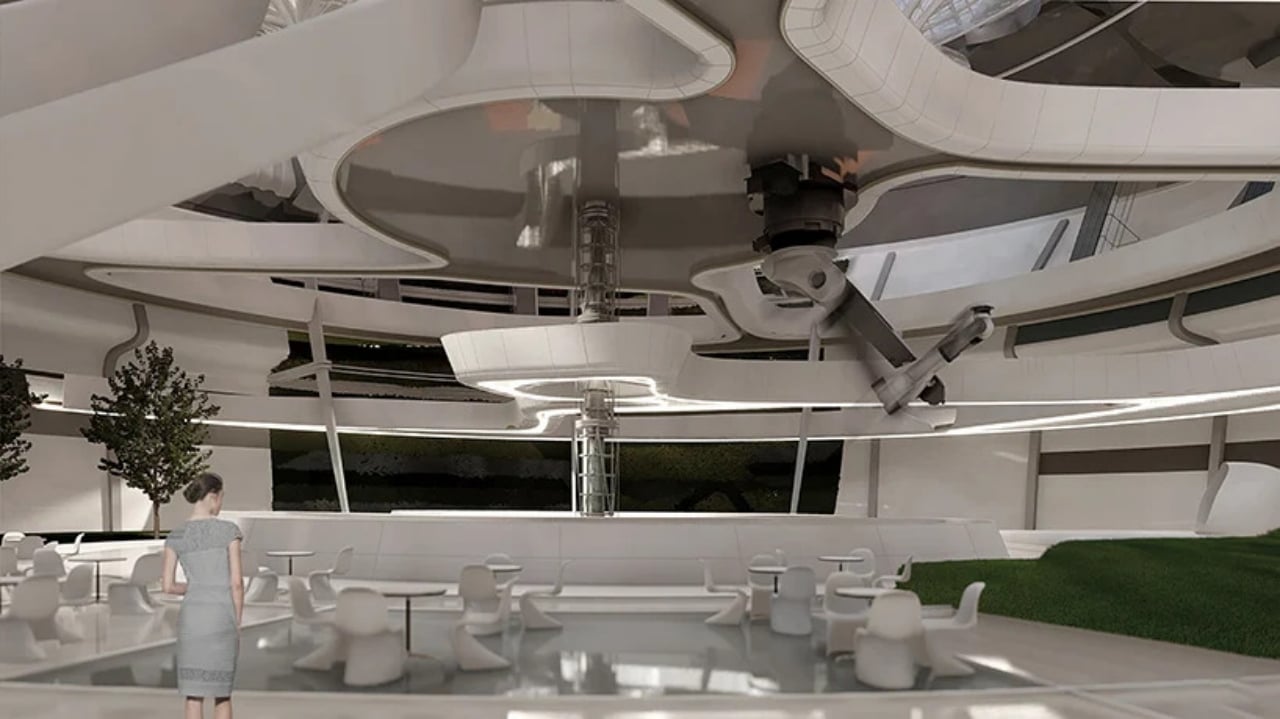
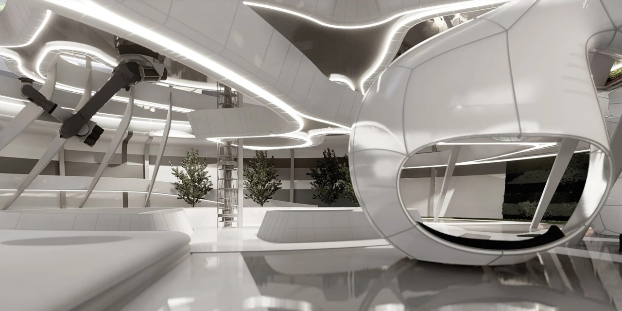
On the inside, the predominantly white motif of the housing prototype definitely gives off futuristic vibes, the clean and blemish-free walls contrasting sharply with the red, barren wastelands outside. From the outside, Genesis v.2 ironically looks incomplete, but that’s an intentional design choice to represent and remind us of humanity’s always incomplete knowledge, especially when establishing a colony on an alien planet.
The post This Martian colony concept imagines what sustainable off-planet housing could look like first appeared on Yanko Design.
Tidak ada komentar:
Posting Komentar