The iPhone 14 will need some out-of-the-box thinking if Apple wants to restore confidence in its design chops.
Apple has always been lauded for how it put design into focus, proving that consumer electronics like computers and phones can be not only functional but also well-designed. It’s that lineage that may have set the iPhone 13 up for disappointment, missing a few marks in both aspects, despite being favorably reviewed. Expectations are understandably running high for the iPhone 14, with many hoping it would finally break from the mold and finally use one of Apple’s wild patents. Of course, Apple isn’t one to make big leaps into the unknown, but there are a few concepts that do sound more likely than others.
After the iPhone 13, there is a growing sentiment even among its fans that Apple needs to make a big bang next year, or at least in 2023 at the latest. It isn’t as much because of the hardware since Apple already has that down to a “T,” with a few caveats. Battery life continues to be a concern, for example, despite optimizations that Apple makes to iOS to stretch out battery life as much as possible. As a company hailed for its designs, Apple has put out a few designs that didn’t sit well even with its fans, like the “trash can” and “cheese grater” Mac Pros, or, closer to home, the wide notch of the iPhone X. After two very similarly designed iPhones, 2022’s iPhone gives Apple the chance to make a clean break or, at the very least, present something fresh and exciting.
The Improbable: iPhone 14 Flip
Designer: ConceptsiPhone
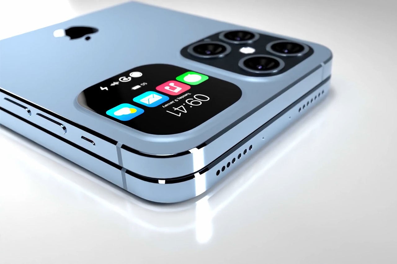
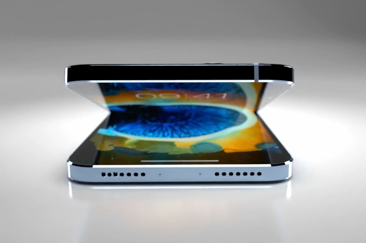
Let’s get this out of the way: Apple is unlikely to turn the iPhone 14 into a foldable phone. It might not be until 2023 before an “iPhone Fold” finds its way into the market, and even that might be a generous estimate. A clamshell-type iPhone in the vein of the Galaxy Z Flip definitely looks chic and stylish, but there are still too many variables for Apple to make a gamble on foldables. It isn’t one to compromise on experience even for the sake of style, and that is exactly what a phone with a fragile flexible screen is.
Samsung has made a lot of progress in making foldable phones more mainstream, or at the very least condition the public to their existence. Part of that is in making the phones more accessible in terms of price, with the Galaxy Z Fold 3 and Galaxy Z Flip 3 claimed to be the most affordable foldable phones in the market today. Recent figures for market analysts and Samsung itself suggest that these two have already outsold their 2019 and 2020 predecessors combined. While actual numbers are unsurprisingly unavailable, it at least suggests that there is a strong market for these phones.
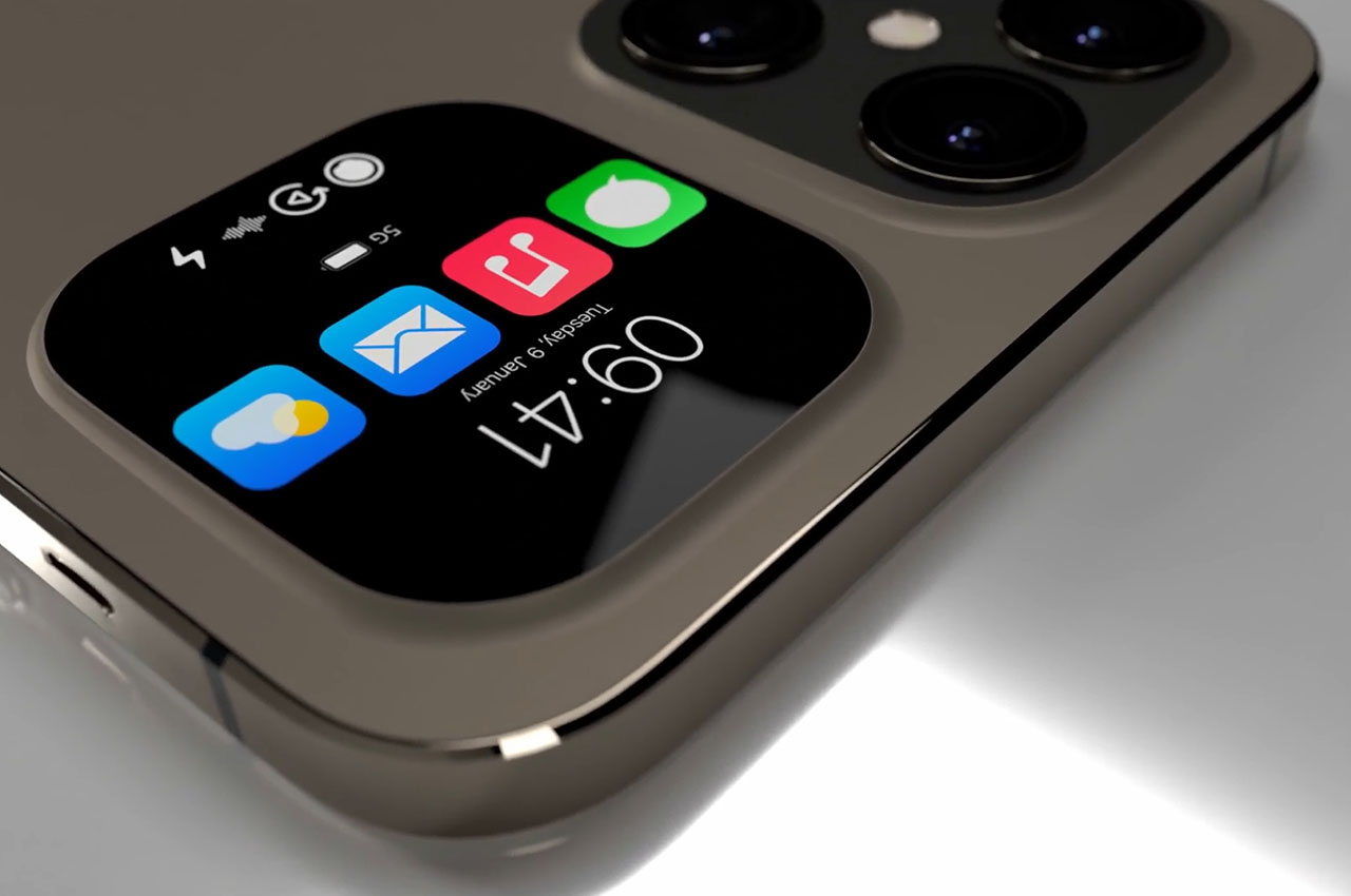
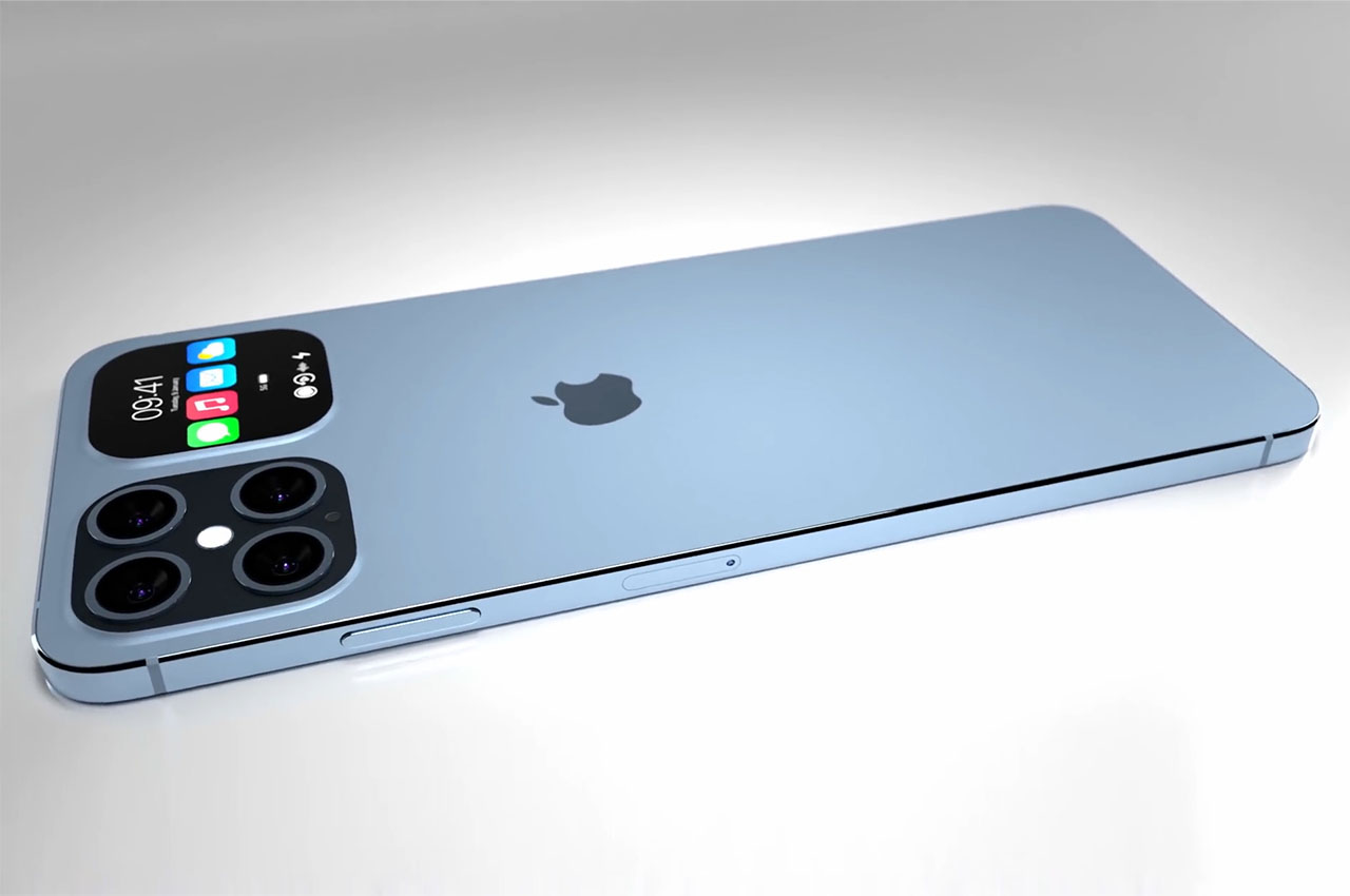
Apple, however, doesn’t always play the same numbers game and places a heavy emphasis on design and reliability. Foldable phones still have ways to go to reach those standards, especially when it comes to reassuring owners that their expensive investments won’t break so easily on the first drop. My Galaxy Z Fold 3 has so far been fortunate enough not to have met any accidents, and it feels sturdy enough to withstand a few falls. The foldable display inside, however, still doesn’t inspire much confidence, and it is unlikely that Apple will embrace that technology until it’s 100% sure of its longevity.
The Plausible: iPhone 14 Slide
Designer: #ios beta news
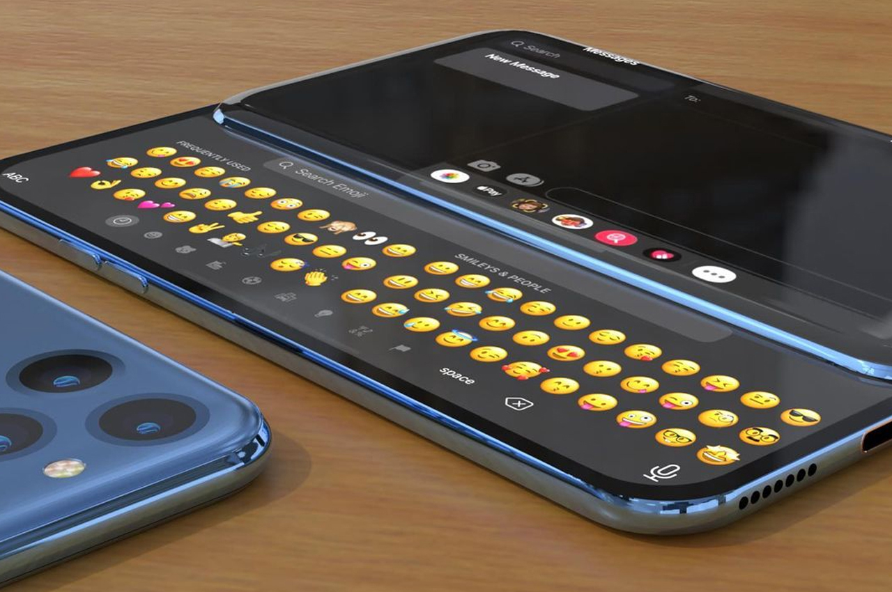
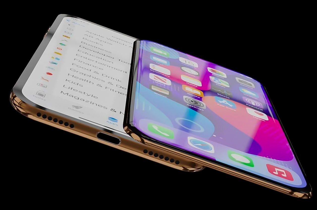
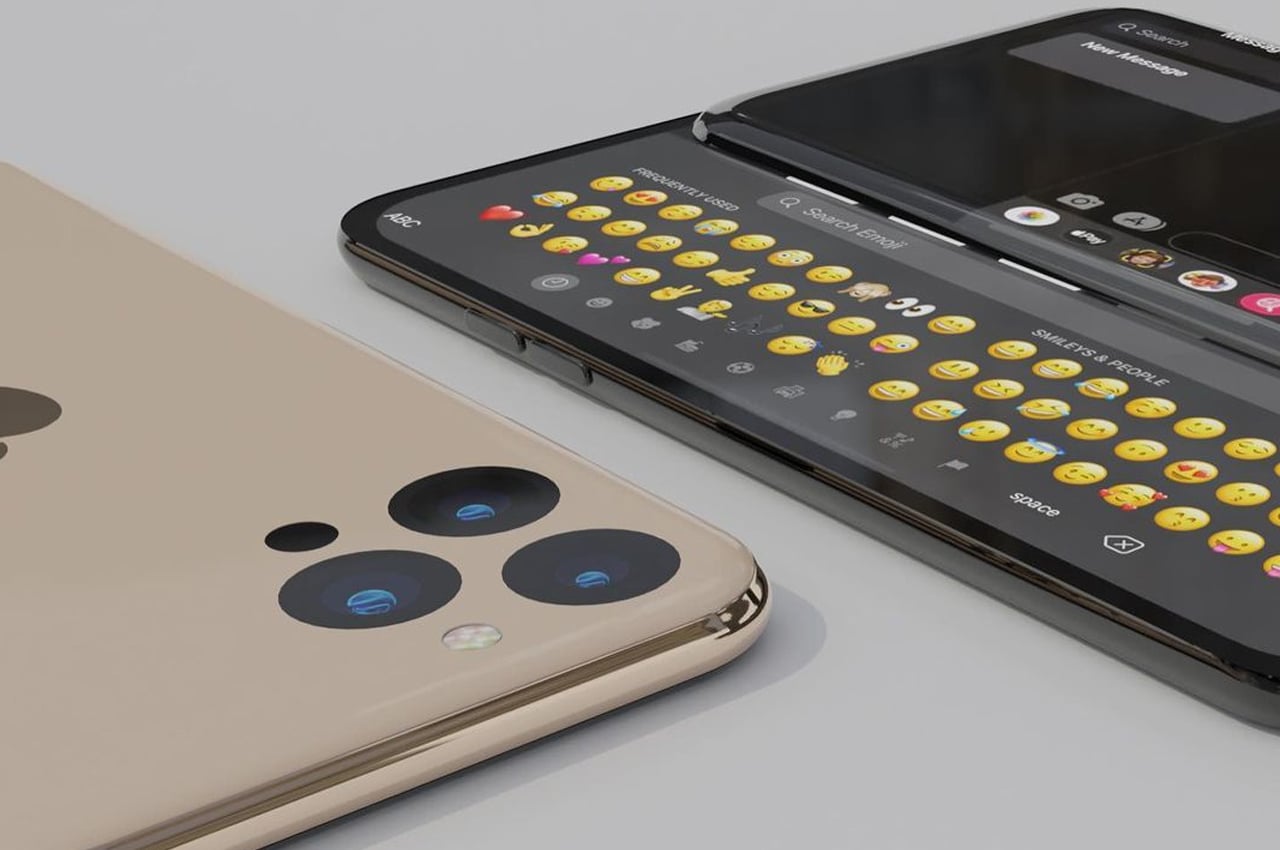
If, however, we would really think outside the box, the iPhone 14 slider concept not only has more appeal but is also more probable than a foldable phone. While the idea isn’t exactly new and has been done before (by Nokia, no less), it’s uncommon enough that Apple could do its magic and be remembered as the one that pioneered or at least popularized “sliders.” It just has the right mix of elegance, usability, and forward-thinking that makes it a likely candidate in case Apple decides to really reach for the stars next year.
The iPhone 14 sliding display concept brings a bit of the past and the future together in one package. The softer curved sides are reminiscent of the iPhone 12 and contrast with the cold and sharp edges that have become one of the iPhone 13’s most criticized design changes. The display hiding underneath offers some extra space for secondary elements, like menus or even a QWERTY keyboard, freeing the main screen to display beautiful content. And, of course, the absence of a camera bump will be much appreciated by everyone.
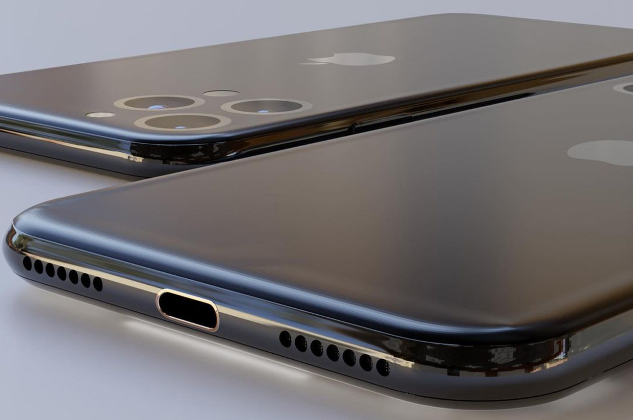
The biggest stumbling block to making this incarnation of the iPhone 14 a reality won’t be the design or the hardware but the software. Apple will have to adjust iOS 16, the version that will be launched next year, to accommodate having a second display off to one side. It can’t be something that’s haphazardly thrown together either, given Apple’s high standards, but it’s something that is still within the realm of possibility for 2022.
The Real McCoy: iPhone 13 Refined
Designer: ConceptsiPhone

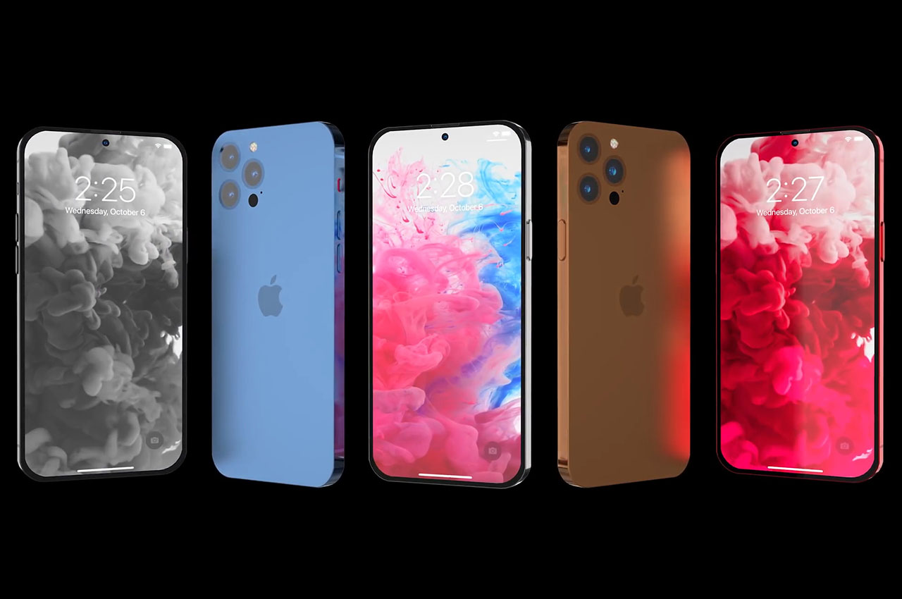
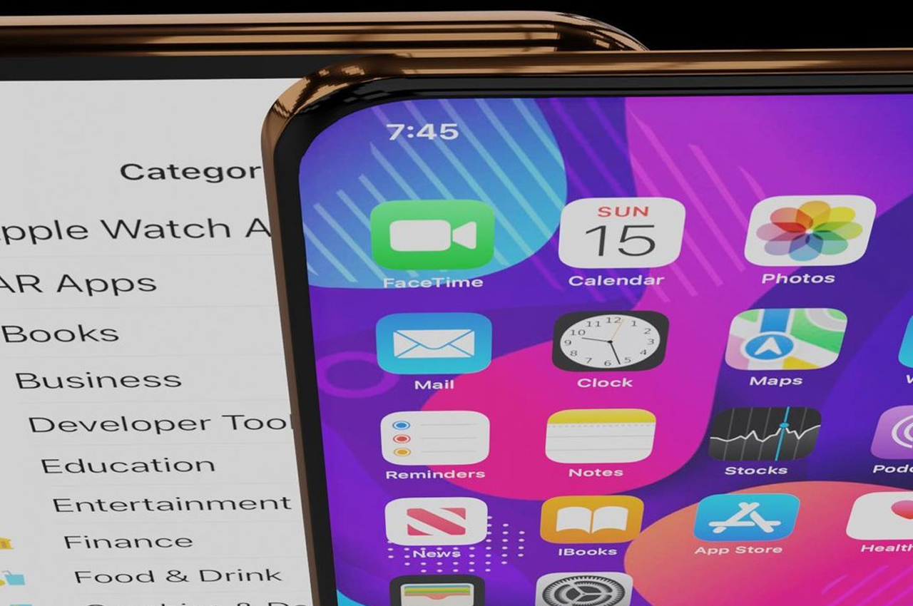
The somewhat harsh reality, however, is that Apple doesn’t exactly jump on the latest trends just to make a sensational product. This makes its designs more iterative rather than revolutionary, though it does sometimes make leaps and bounds like the iPhone X. If it were to design an iPhone 14 that’s closer to reality, it would be one that has very few changes, like a true full-screen display without a notch.
This iPhone 14 concept brings together many existing designs and features into something that is completely Apple. Sadly, the flat, chamfered edges are still here to cut into your palm. The cameras, however, are flushed against the phone’s back, which does imply that this iPhone could be a bit thicker than the iPhone 13. Hopefully, the extra space can be used to squeeze in more battery, something that’s always a concern for iPhone owners.
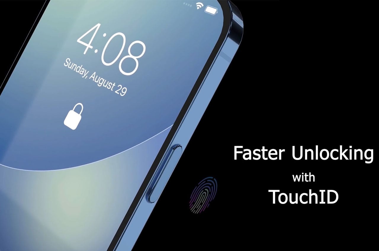
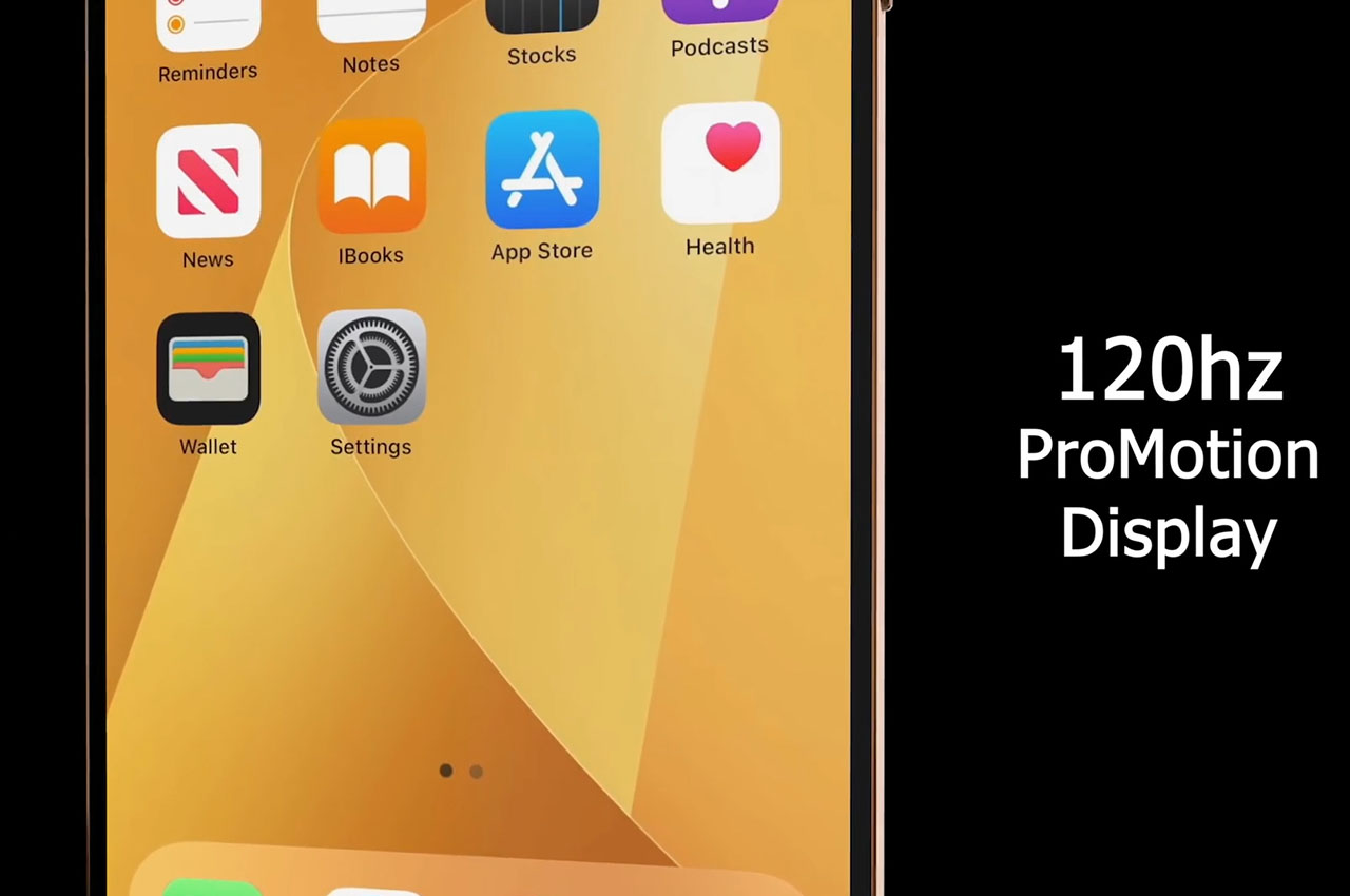
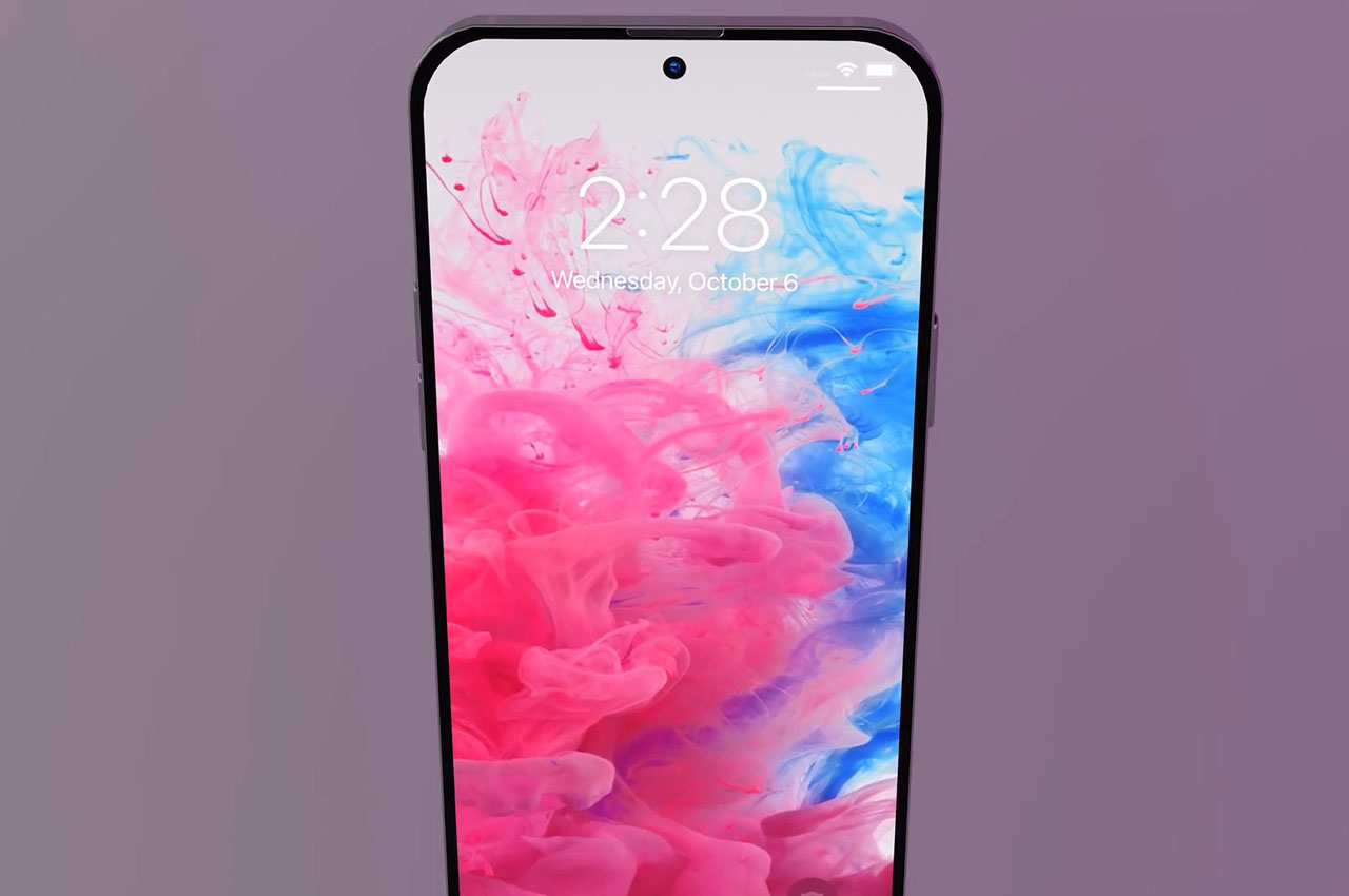
While those changes are well within Apple’s capability to make, the switch from a notch to a punch-hole cutout could prove to be the most controversial aspect of this concept. This design doesn’t have visible room for the iPhone’s full Face ID hardware, which could be hiding beneath the screen. Apple has already been repeatedly rumored to be working on under-display sensors, so moving up its schedule for a 2022 debut isn’t that off the mark at all.
Final Thoughts
Given Apple’s track record, we’re almost certain that the iPhone 14 will still resemble this year’s iPhone, perhaps with a few refinements here and there. The company is one that lets a design stew for two or three generations or even more before changing the formula, even if the design is widely criticized or disliked, like the MacBook Pro’s Touch Bar. Except for consumer clamor, Apple might not see any dire need to change the iPhone’s current design, especially since it’s trying to consolidate its design language across different devices. The iPads and iPhones now look more similar after all, and next year’s Apple Watch is expected to follow suit. There is, of course, always the possibility that the company will suddenly change directions, like when it abruptly ended the iPhone X’s design after only two generations, but we also can’t expect it to make very drastic changes that would be totally out of character for Apple.

The post How Apple’s iPhone 14 design could bring the brand back to glory after the iPhone 13 snoozefest first appeared on Yanko Design.
Tidak ada komentar:
Posting Komentar